
Every premium and members-only resource for $9.99/month, as a no-commitment subscription. See the plans

PalateKit

Menu

Request a resource

Describe the resource you are missing in one sentence. We will email you when it is published.

0 / 280

Unlock PalateKit

Unlock everything

Plan

Paying means accepting our terms of sale.

Secure payment by Stripe. Receipts and invoices sent by email.

Welcome back

Sign in to install, download or save this resource. A free account is enough for free resources.

Card deck that spreads into a row v1.0.0

Use this resource to group several widgets in a compact stack that unfolds

New

  • 593 downloads
  • 211 likes
  • 213 saves

Free

Install with the CLI

In a terminal, from the folder you want:

npx --yes palatekit@latest install stacked-cards-spread-on-click

First time: connect the CLI with

npx --yes palatekit@latest login

The agent adds to your page a CSS-only React (Tailwind) component. You replace the demo cards with your own, of the same size. You get a stack that saves horizontal space.

Mostly picked by

Updated November 2, 2026

Details

Generates with
Your agent's model
Uses
  • React
  • Tailwind CSS
Licence
MIT

Similar resources

View all

What you get

  • README.md: usage guide
  • card-spread.stories.tsx: the author's original file
  • card-spread.tsx: the author's original file
  • card-spread.mdx: the author's original file

Good fit for

  • Dashboard with several widgets
  • Gallery of note cards
  • Compact features section

Not for

  • A site without React or Tailwind CSS, without adapting it
  • A motion-sensitive audience, without adding prefers-reduced-motion

Tags

  • card
  • stack
  • hover
  • widgets
  • dashboard

About

You say

"Add the spreading card deck to my dashboard with my four widgets."
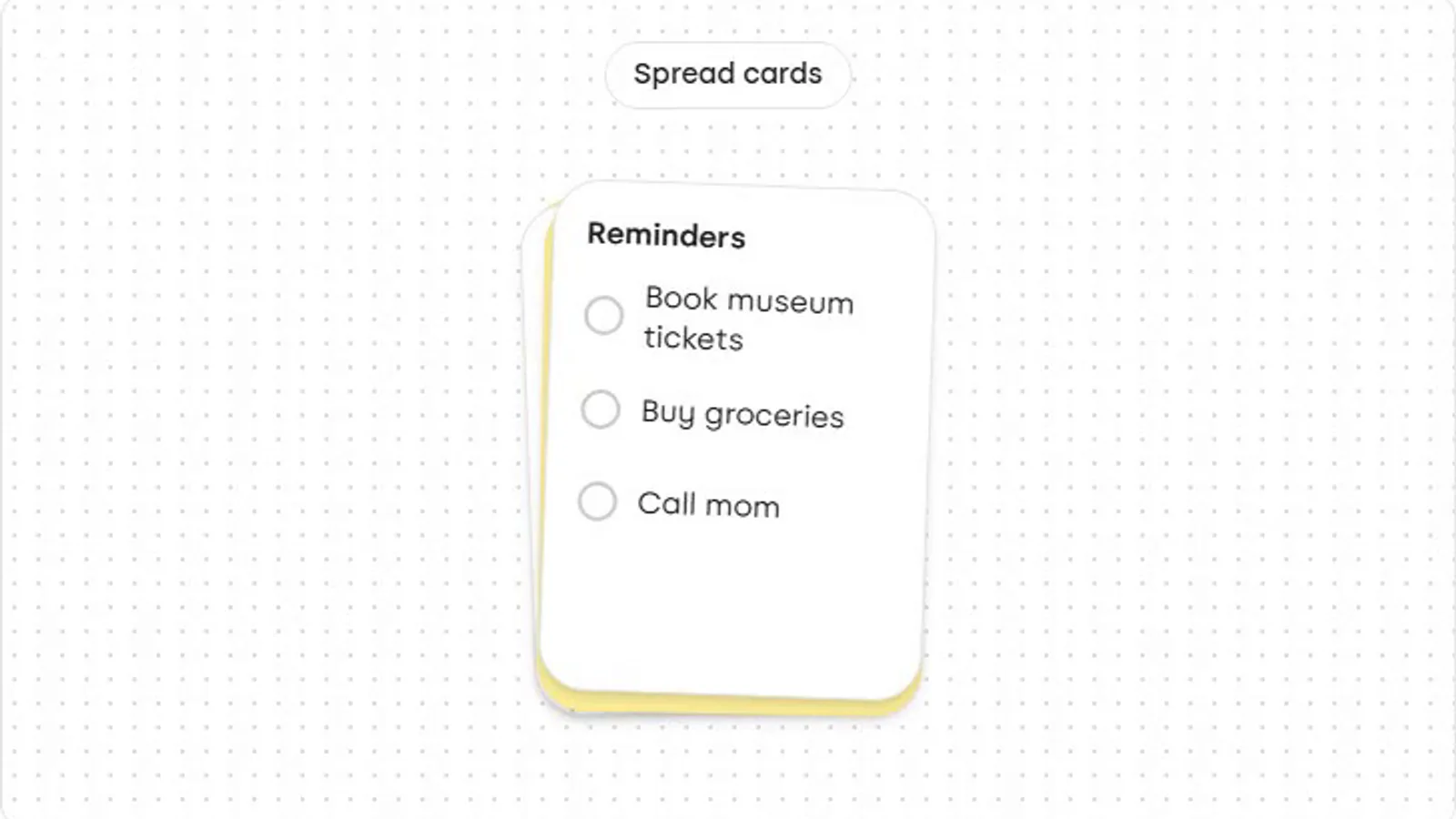
A card deck that fans slightly on hover and spreads into a row on click.

Component published by sudhashrestha under the MIT license, resource page and guide written by PalateKit.

Show more

Prerequisites

You bring
Your React project with Tailwind CSS and Your colors and texts
Dependencies
React and Tailwind CSS

How to use it

  1. Copy card-spread.tsx into your React project's components folder.
  2. Make sure Tailwind CSS is set up in the project.
  3. Ask the agent to place the component on the page and match it to your brand.

Content preview

Files

  • animata/card/card-spread.stories.tsx0.4 KB
  • animata/card/card-spread.tsx2 KB
  • content/docs/card/card-spread.mdx3 KB
  • LICENSE1.1 KB
  • NOTICE-PALATEKIT.md0.4 KB
  • README.md0.7 KB

Origin and licence

Modified by PalateKit

Author
sudhashrestha
Source
github.com/codse/animata/tree/25c27e5a874c60a56dcc1609df3b2c4f5f8456f8/animata/card/card-spread.tsx
Licence
MIT

Notice

Version modifiée de « card-spread » (sudhashrestha, MIT) : traduction française et fiche par PalateKit.

User reviews

–

No ratings yet

Loading reviews…

Delete your review?

Your rating and comment will be removed from the page.

Frequently asked questions

Which packages do I install?

React and Tailwind CSS are enough.

Does it work without Next.js?

Yes, in any React project with Tailwind CSS; just drop the "use client" directive if your tooling does not support it.